Understanding the difference between CMYK and RGB colour models is essential for designers, business owners, and anyone seeking to print branded collateral such as custom apparel or promotional products. Each model has unique processes and applications that influence the final printed product. In this blog post we will explore these differences and explain how to prepare your files for print with great results.
RGB
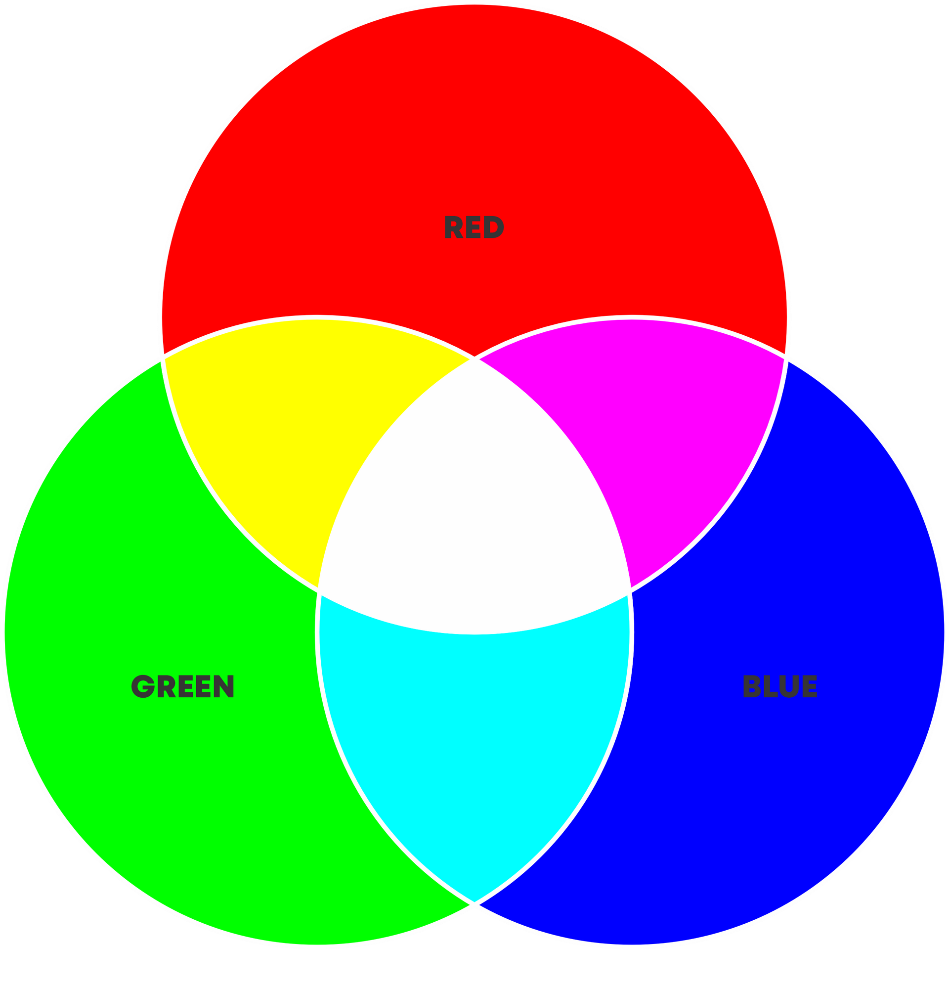
RGB stands for Red, Green, and Blue, the primary colours of light. Colours in the RGB model are created by mixing these three lights in various combinations and intensities.
CMYK
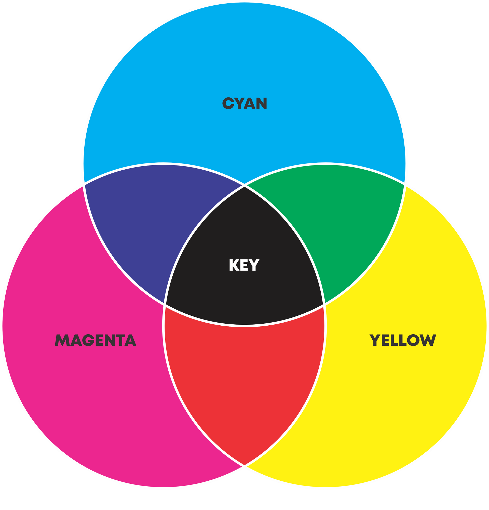
CMYK stands for Cyan, Magenta, Yellow, and Key (black). These are the primary colours of pigment used in the printing process. "Key" typically refers to the black ink used in print, which adds depth and detail to the printed images.
Additive and Subtractive Colour Processes
For our purposes colour can be divided into two primary processes: additive (for digital graphics) and subtractive (for printed material). These terms simply refer to how the colour is created and perceived by our eyes. Think of additive as adding (emitting) light into the environment and subtractive as removing (absorbing) light from the environment.
Additive
In RGB, colours are created by combining light itself. by blending red, green, and blue light in various intensities screens can produce a broad spectrum of colours. This model requires electricity to power the light emissions which is why it can only be utilised by digital devices.
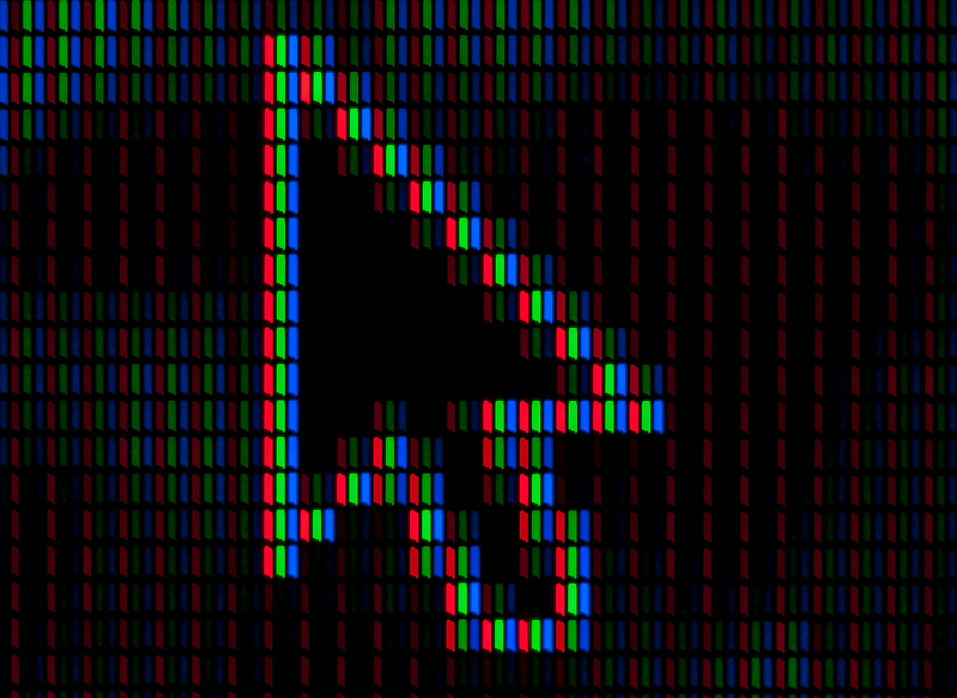
When the red, green and blue channels are all shown at full luminosity they will produce a white appearance. Look at the above image of a zoomed mouse cursor on a computer screen, have a good squint and notice how the three channels blend into one to create the appearance of white.
One important thing to remember is all digital screens will be calibrated differently so colours will vary slightly from device to device.
Subtractive
Conversely, CMYK is a subtractive colour process. This means it relies on inks and dyes to absorb certain wavelengths of light from the environment and then reflecting back others to the viewer. The reflected light is the colour we will ultimately see
As more colours are mixed together, less light is reflected back to the eye, resulting in a darker appearance. This model is used in print applications such as garment and apparel printing because in such instances there is no power source available to emit light. As a result, CMYK colours usually appear darker and less vibrant than their RGB counterparts.
The image below illustrates how the CMYK colour model is applied in a printed portrait. When zooming in we can see the individual cyan, magenta, yellow, and black dots that combine to create the perceived colours when viewed from a distance. This highlights how different colours are formed by varying the density and overlap of these dots.
Comparing and Converting
Compare the before and after below; the left image looks fresh and vibrant because it is being backlit, using RGB's light-emitting properties to enhance its colours. However, if you were to print this same image using a CMYK printer, the result will appear different. The colours become less vibrant, the shadows become darker and the highlights lose their lustre.
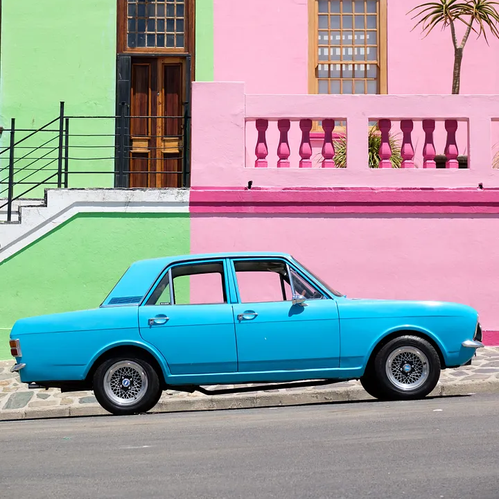
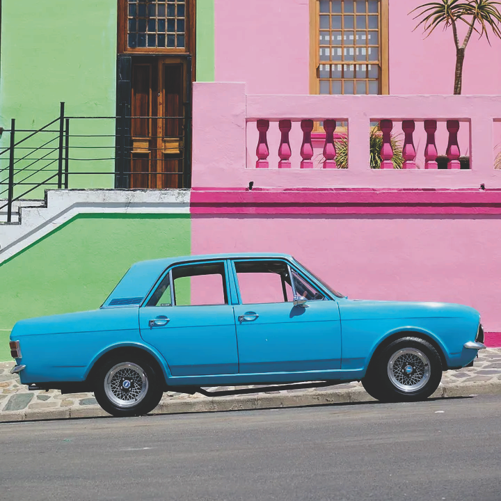
This effect becomes very obvious when dealing with graphics that use only a few solid colours such as those found in logos and other branding collateral. Compare the below images with the original RGB logos on the left and the CMYK conversions on the right. Once converted to CMYK, the colours become dull and washed out.
This underlines the importance of considering all potential applications of your logos and branding before choosing colours for your brand. Most brands, at some point, will end up creating printed materials so it is important to pick brand colours from the get-go that will look consistent across both print and digital applications.
If you have already committed to brand colours that don’t print well you have a few options:
- Create a secondary colour palette for print-only applications. this can be an easy solution however it is important to remember that one of the keys to a good brand identity is consistency which includes using the same colours across all marketing collateral.
- Use a black/white or grayscale version. This option has similar pitfalls to the last option but is still a common practice in the branding world as there are many branding applications that cannot utilise colour.
-
Consider updating your brand. Start by selecting a colour that prints well and use it for digital applications too. Often, you can adjust an existing colour that looks good digitally to fit within the printable range, avoiding the need to choose an entirely different colour and losing brand recognition you may have built up by using this colour in the past. It is recommended to engage a graphic designer or printer to help with this option.
Pantone Matching System
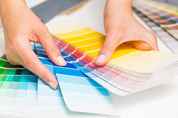
To avoid using colours that don’t print well, graphic designers will often pick colours from the Pantone Matching System (PMS) also known as “spot colours”. This system is an industry standard that includes a wide array of colours which are compatible with print and product design. In addition to filtering our colours that don’t print well they also act as a reference point for printers to reproduce specific colours consistently and accurately.
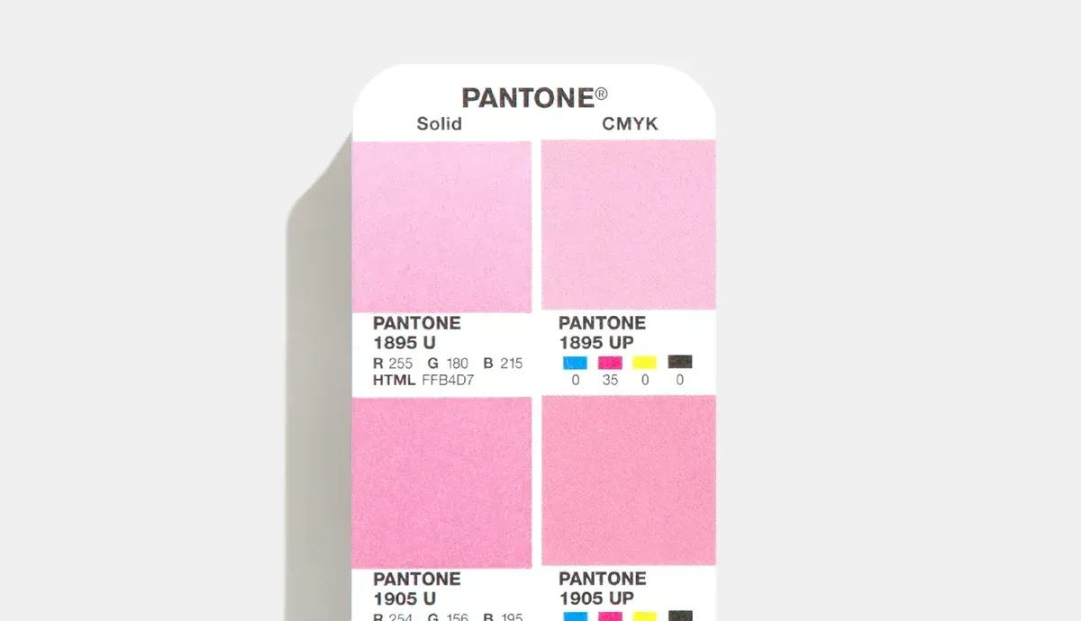
When a colour is picked from Pantone reference booklet, the colour code can be provided to your printer and they will print samples to reference against the Pantone booklet to get the closest match possible.
The only problem with this method is that you will require a physical booklet to choose your colours. Despite these colours being easily accessible online, they aren’t good reference points as screens won’t display them accurately. The good news is most printers and reputable graphic designers will have a PMS booklet to reference in person.
What This Means for You as a Customer
As a customer, looking to provide files for printing, it’s essential to understand that the colour model you use can significantly affect the final output. Here’s what you need to keep in mind:
- File Preparation: Check with your printer about which colour model they prefer. Most printers will accept both RGB and CMYK, however if a RGB file has been supplied, the printer will do a conversion to CMYK before creating the artwork proofs. The reason for this is to avoid any surprises when the final product gets printed and the results do not match the vibrancy of the original RGB file.
- Colour Expectations: Be aware that colours might look different on your screen compared to the printed material for the reasons discussed above. If you are at all concerned, it’s a good idea to ask for a proof and/or organise a sample to check the colour accuracy before the final run.
- Check the conversion yourself: If you are so inclined you can use design software that allows you to work in both RGB and CMYK, like Adobe Photoshop or Illustrator. This way, you can design in RGB for more vibrant colour creation and convert to CMYK for the print-ready files. If there is a big variance between the RGB and CMYK versions consider choosing a different colour or using a black and white version of your artwork.
- Consider Pantone: If colour accuracy is a high priority for you consider exploring the Pantone Matching System to pick colours that will remain consistent and accurate across all your print jobs.
- Communicate with your printer: Colour models and acronyms can be a confusing topic even for people who work with it everyday. If you are feeling lost or have questions just reach out to your printer and they should be able to offer you advice and guidance to get the best result for your situation.
Originally published by Riley Dromgold (Capital Prints).
Share:
Elevate Your Brand: A Dive Into the Wonderful World of Embroidery
Picking the Right Hoodie for the Job ft. AS Colour